Editor User Interface
Back to: Exploring the Image Hopper Plugin
Before we discuss the different Image Hopper Editor tools in greater detail, let’s first familiarize ourselves with the user interface (UI).
First, bring up the Editor by previewing your form and uploading any image you want.
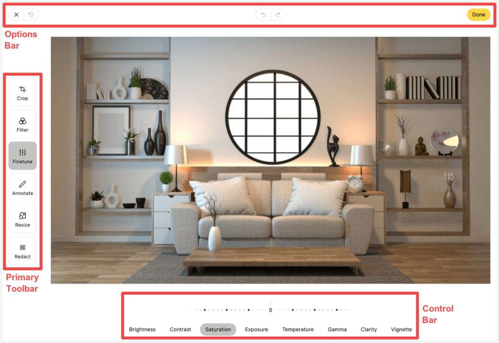
The Editor’s user interface is comprised of three major areas/components:
Options Bar

The Options Bar provides different options to change the behaviour of the UI and the current state of the image being edited. The following options are as follows:
Primary Toolbar
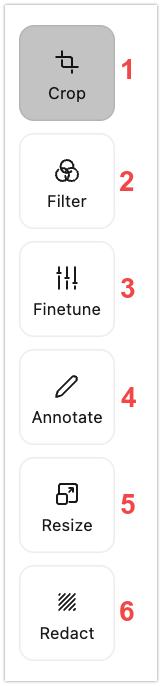
The Primary Toolbar holds all the six primary tool tabs of the Image Hopper Editor. It is located along the left side of the Editor’s user interface.
- Crop – crop the image to a specific size, and rotate, flip, zoom in/out of the image
- Filter – choose from 13 different photo effects to apply on the image
- Finetune – control the look and feel of the image
- Annotate – annotate, draw, and write notes on the image
- Resize – manually change width and height of an uploaded image
- Redact – remove any sensitive content that are visible on the image
Click on a specific primary tab to display all the controls belonging to it.
Control Bar
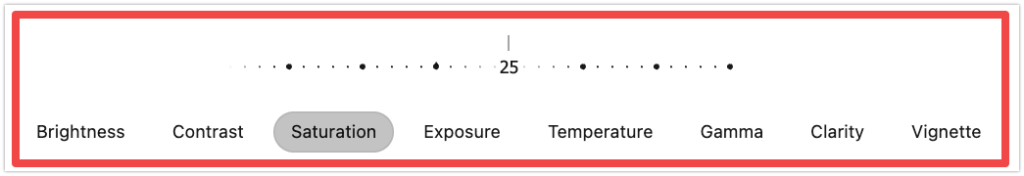
The Control Bar contains all the controls needed to edit the image which are located at the bottom of the Editor’s user interface. The controls displayed here vary depending on the functions of the currently selected primary tab.
User Interface Accessibility
Some parts of the Editor’s user interface can be controlled using the keyboard. When navigating the Primary Toolbar, use the up/down keys to highlight the primary tab, and press Enter to open its Control Bar.
The Crop and Finetune primary tabs both use a slider to control the changes being made to the image. You can use the left/right arrow keys to control these values in increments of 2 points, or 18 points by holding down the Shift key.
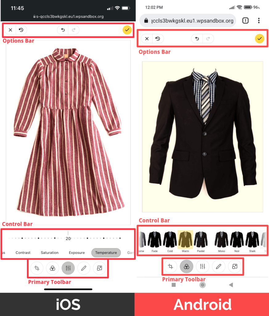
Mobile User Interface
The Editor‘s mobile user interface has the same area/components but are arranged differently. At the top of the page you’ll find the Options Bar, just under the image you’ll find the Control Bar and then the Primary Toolbar at the bottom.
Now that you’ve learned how to navigate the Image Hopper Editor’s user interface, take your time to get used to these features as they are very useful to make editing sessions more efficient. In the next lessons, if you change your mind about an edit you’ve made, just click Undo or Revert.
If you’re ready to dive deep into the different features of the Image Hopper Editor, mark this lesson complete.