Create Charts to Show Registration Statistics
Back to: Automate Your Gravity Forms Reporting with GFChart and Gravity PDF
License Note
This lesson requires GFChart All License.
GFChart Add Ons Installation
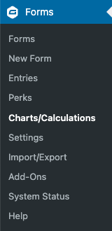
Once you’ve installed and activated GFChart, you’ll see a new item added under your Forms menu: Charts/Calculations.
In addition to the base plugin, GFChart, you’ll also want to install Charting vs Time Add-On, Image Charts Add-On, and Scheduled Notifications Add-On. (Note that you’ll need to contact GFChart Support for a version of Scheduled Notifications that is compatible with Gravity Forms 2.5.)
Building the Weekly Registration Bar Graph
Once these are all installed, click on the Charts/Calculations option in the Forms menu and choose Add New at the top of the screen.
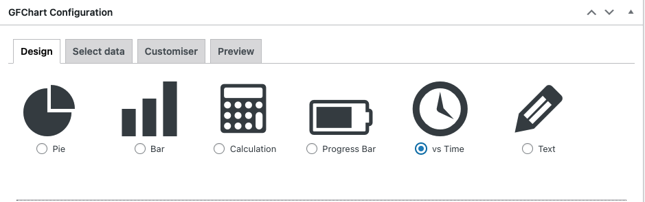
Give your chart a name like Weekly Conference Registrations, then choose your registration form as the Source Form. In the design options, choose “vs Time.”
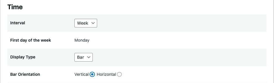
Set the Interval to Week, Display Type to Bar, and Bar Orientation to Vertical as shown below.
Next click on the arrow labeled Select Data to set up the chart.
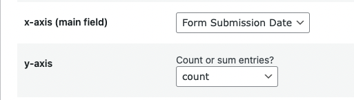
For the x-axis choose Form Submission Date.
For the y-axis choose Count.
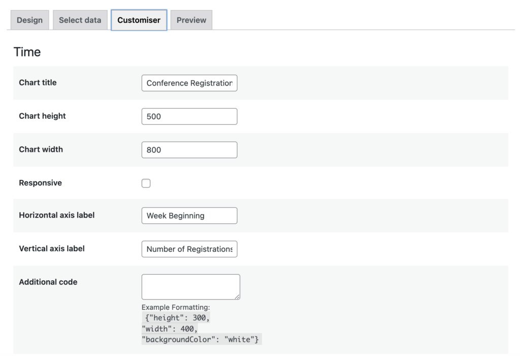
Next click the arrow labeled Customizer to adjust the appearance of your chart.
Give your chart a title like Conference Registration by Week.
I like to set the Chart height and Chart width after looking at the Preview, so we’ll come back to those.
Check the box for responsive if you would like to make your chart responsive based on screen size.
Label the Horizontal Axis “Week Beginning.”
Label the Vertical access “Number of Registrations.”
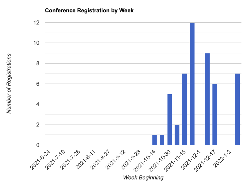
Now advance to the chart preview by clicking the arrow labeled Preview.
If the preview looks too small, click on the customizer tab to adjust the dimensions for the Chart height and Chart width. Mine is set to 500 x 800.
With those settings my chart preview looks like this:
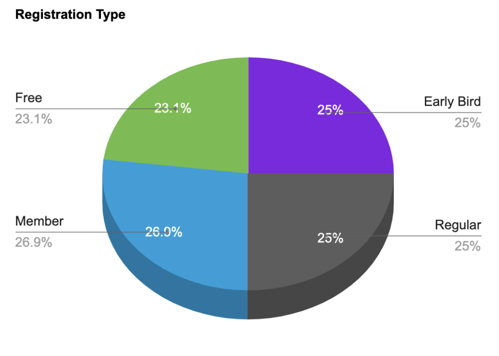
Create a Registration/Ticket Type Chart
Next we’ll create a pie chart that shows the different types of registrations that have been purchased. The process is similar to the first chart we created.
First click the button to create a new chart, name your chart Registration Type then choose your registration form as the source form. In the design options, choose Pie, then select your style:
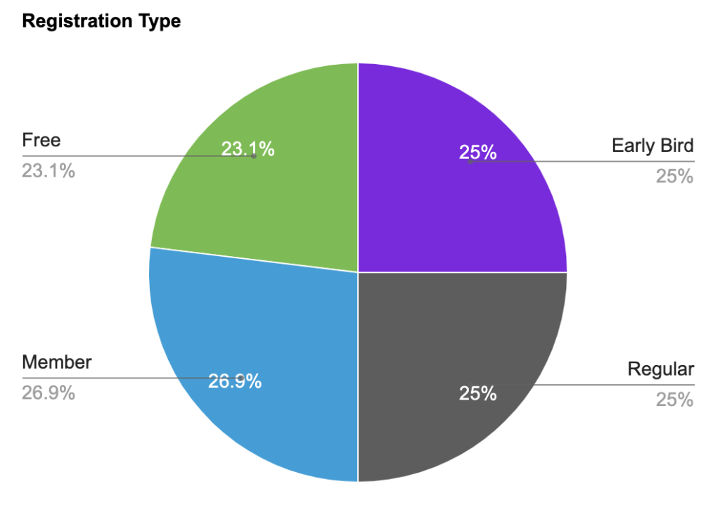
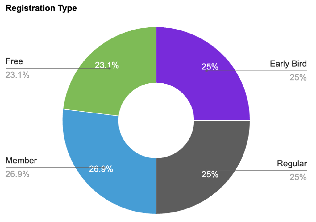
Then choose your legend type. My preference is Labeled, as you see in each of the options above.
Next click on the arrow labeled Select Data.
Choose the field that you want to display results from. My field is labeled Ticket Type.
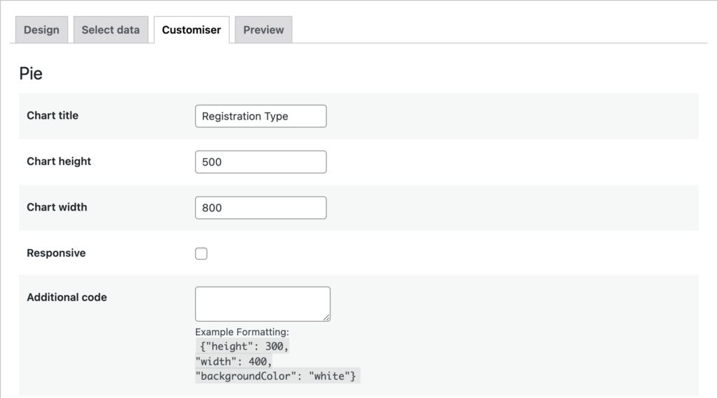
Now click the arrow labeled Customizer.
Give your chart a title like Registration Type.
Check the Preview to determine the best Chart height and Chart width. Mine is set to 500 x 800. (Note: making your charts all the same size gives the stylized PDF a cleaner look if you choose to use that option.)
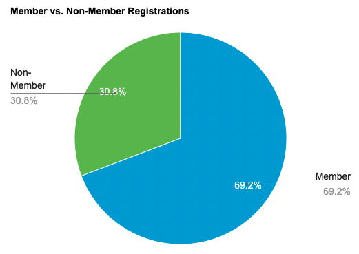
Create a Member Type Chart
In this example, I have just Members and Non-Members and it is helpful to see what percentage of my attendees belong to each group.
This chart is set up in the same manner as the chart above. Repeat the steps above, this time choosing the field that includes the Member Type question. The final result will look like this.
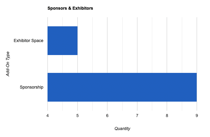
Create a Sponsor/Exhibitor Chart
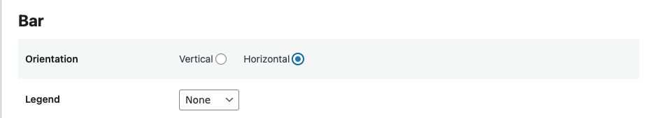
This chart will be created as a bar chart, but with horizontal bars instead of the more traditional vertical bars.
For this chart choose the Bar design option.
In the Bar format options, choose Horizontal orientation and your choice of Legend.
Click the arrow labeled Select Data to advance to the next page. There, choose the field that will form your x-axis. My field is called Add Ons (be careful not to select one of the answer choices in your field because then your graph will only include that data and not the data for the other answer choices).
For the y-axis choose Count so that the number of entries will be what shows on your graph.
Choose whether you want to sort your graph by Label or Value. Below is a screenshot from the form showing the difference between Label and Value. The label is what shows to your customers. The value is for internal use purposes. In this case, you could use it to customize the sort order of the fields on your bar chart.
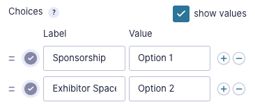
Note that if I sort by Label in ascending order, Exhibitor will appear first even though Sponsorship is first in my options. But if I make use of the Values option, I can create values that will organize them in the order that I prefer. However, note that if you choose to sort by value, it will be your value that labels the bars, so you’ll want it to be something descriptive.
Once you have completed the fields on this page, click the Customizer arrow to get to the next page.
Give your chart a title like Sponsor and Exhibitor Registrations.
Set your Horizontal Axis Label to Quantity.
If you’d like you can label the Vertical Axis as Add-On Type or leave it blank if the bar labels are self-explanatory.
Displaying Data for a Limited Time Period
You can use the Relative Date settings in GFChart to display data from a limited time period (for example, form submissions received within the last week).
In a chart type other than vs Time, you’ll find a date range option on the Select Data tab when you are creating your chart. You can enter specific dates in this field, or choose relative dates. You can see examples of relative date options in the GFChart documentation.
This means the data displayed at the time the chart is produced will fall within these parameters. So a chart automatically sent each week with the -1 week relative date will show entries only from the past week.
Displaying Your Charts
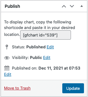
These charts can be placed on a page on your site (see this course about pairing GFChart with GravityView to display detailed data on your site). You also have the option to include them in your Gravity Forms confirmations and notifications. Just copy the short code from your chart (in the Publish box on the right of the screen) and paste it where you want the chart to show up.
If you prefer to receive a report sent to you on a scheduled basis, continue on to the next lesson to learn how to set up a weekly automated report.